Lameazoid.com Rotating Header Image

Power Rangers

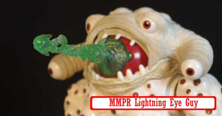
Power Rangers Lightning Collection Eye Guy

Of all of these Lightning Collection monsters, Eye Guy is one that differes quite a bit from the show design. For one, he’s a lot more bulked out. The original costume has a weird design and you can tell the person inside is a lot smaller than the suit by the weird arms. It’s not inaccurate, it’s just a bit more stylized.

The eyes are also a lot less detailed than the actual suit, which is likely a cost cutting measure. That said, there are a lot of eyes and it’s kind of creepy.

I also think the accessories are neat. I have no memory of this monster on the show but there is essentially a separate dismembered eye, I’m not sure if this is intended to be the same eye that makes up the main head or a second large eye since most creatures have two eyes. Both are compatible with a beam effect that can be attached over the iris itself. The beam effect is a bit short but I’m not sure a long beam would have been much better, so it’s probably just fine in the end.

The big monster’s eye also has a closing eye lit that let’s it “blink”. The power Rangers Wiki suggests that this eye is the weak spot for this particular monster. He’s a creepy huge beast though. I like it quite a bit.

Power Rangers Lightning Collection Pudgy Pig

For some reason I always think of Pudgy Pig as the first monster that the Power Rangers fought, but that is not accurate. It’s like the 5th or 6th, and heck, even King Sphinx was earlier than that that. There were two releases for Pudgy Pig, one early on for SDCC which included a Lunch Box case. And that’s essentially the only difference I think,. which is why I was kind of glad I skipped it. There was a bit of a controversy because the promo shots kind of implied that the Lunch Box version included a bunch of extra accessories, to recreate the food fight picnic area from the show, but in reality it just came with a couple of pieces of food.

I ended up with the regular version, which is just the pig with it’s weapons. Which is fine because that’s all I really care about. Something notable, despite the shape, the figure works pretty well to keep itself upright. It’s a big heavy ball with legs, it should be a balancing nightmare.

The fun part of this thing is the huge opening jaw that lets it eat all sorts of things, which is goofy and fun.

The articulation design is pretty neat as well given the shape and style of this figure, the arms and shoulders are particularly clever and overall it’s a much more poseable figure that one would expect.

Power Rangers Lightning Collection King Sphinx

I have a weird relationship with Power Rangers. I never was a huge fan of the series, though it actually does check a lot of boxes in my array of interests. Most of what I remember is watching the OG Mighty Morphin. I think I watched the Ninja stuff, and then I want to say Turbo was the “third iteration” and my interest kind of fell off around that time.

These monsters though in the Lightning Collection Line. Everything about them really hits for what I am liking now. And I admit, I’ve been a bit of a sucker over it, because I’ve picked up most of them and inevitably, they go on super clearance because apparently no one is buying them. I think the only one I didn’t go for was Pumpkin Rapper, which sometimes I kind of regret.

King Sphinx was the other release along side Pumpkin Rapper in wave 1 of these monsters. I like him, he’s big and bulky and tough looking. I think part of what helps my enjoyment of these figures, versus the more hardcore Power Rangers fans, is that I am not a hardcore fan. It seems like these monsters are, mostly accurate to the source material, but they are a bit more, we’ll say, stylized, to fit the aesthetic of the line. For example, King Sphinx’s face is kind of off quite a bit.

It’s kind of an odd choice. These are almost all unique molds, by the nature of their designs. So why not make it super accurate? Also, Power Rangers is a live action show. These monsters all exist as giant human sized costumes. There isn’t the problem from adapting a 2D comic to cartoon design to a 3D figure media where you need to figure out how to make things work in the real world and not make the faces look weird at head on angles or something. These are all based on real world actual physical things.

That said, I think I prefer the stylized look. They look much more menacing and much less goofy. It’s also possible they are based on some comic designs as well or something, though I have never seen a Power rangers comic.