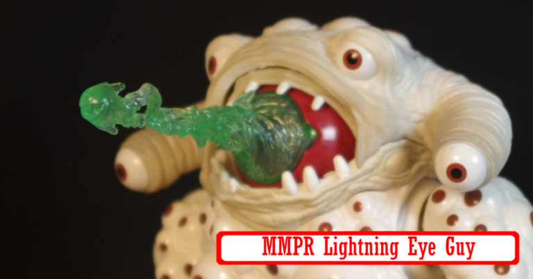
Of all of these Lightning Collection monsters, Eye Guy is one that differes quite a bit from the show design. For one, he’s a lot more bulked out. The original costume has a weird design and you can tell the person inside is a lot smaller than the suit by the weird arms. It’s not inaccurate, it’s just a bit more stylized.
The eyes are also a lot less detailed than the actual suit, which is likely a cost cutting measure. That said, there are a lot of eyes and it’s kind of creepy.
I also think the accessories are neat. I have no memory of this monster on the show but there is essentially a separate dismembered eye, I’m not sure if this is intended to be the same eye that makes up the main head or a second large eye since most creatures have two eyes. Both are compatible with a beam effect that can be attached over the iris itself. The beam effect is a bit short but I’m not sure a long beam would have been much better, so it’s probably just fine in the end.
The big monster’s eye also has a closing eye lit that let’s it “blink”. The power Rangers Wiki suggests that this eye is the weak spot for this particular monster. He’s a creepy huge beast though. I like it quite a bit.
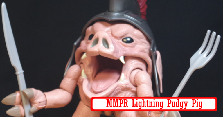
For some reason I always think of Pudgy Pig as the first monster that the Power Rangers fought, but that is not accurate. It’s like the 5th or 6th, and heck, even King Sphinx was earlier than that that. There were two releases for Pudgy Pig, one early on for SDCC which included a Lunch Box case. And that’s essentially the only difference I think,. which is why I was kind of glad I skipped it. There was a bit of a controversy because the promo shots kind of implied that the Lunch Box version included a bunch of extra accessories, to recreate the food fight picnic area from the show, but in reality it just came with a couple of pieces of food.
I ended up with the regular version, which is just the pig with it’s weapons. Which is fine because that’s all I really care about. Something notable, despite the shape, the figure works pretty well to keep itself upright. It’s a big heavy ball with legs, it should be a balancing nightmare.
The fun part of this thing is the huge opening jaw that lets it eat all sorts of things, which is goofy and fun.
The articulation design is pretty neat as well given the shape and style of this figure, the arms and shoulders are particularly clever and overall it’s a much more poseable figure that one would expect.
I have a weird relationship with Power Rangers. I never was a huge fan of the series, though it actually does check a lot of boxes in my array of interests. Most of what I remember is watching the OG Mighty Morphin. I think I watched the Ninja stuff, and then I want to say Turbo was the “third iteration” and my interest kind of fell off around that time.
These monsters though in the Lightning Collection Line. Everything about them really hits for what I am liking now. And I admit, I’ve been a bit of a sucker over it, because I’ve picked up most of them and inevitably, they go on super clearance because apparently no one is buying them. I think the only one I didn’t go for was Pumpkin Rapper, which sometimes I kind of regret.
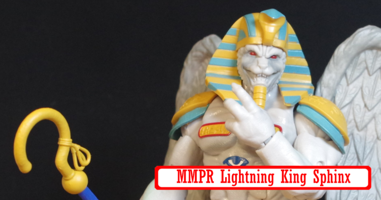
King Sphinx was the other release along side Pumpkin Rapper in wave 1 of these monsters. I like him, he’s big and bulky and tough looking. I think part of what helps my enjoyment of these figures, versus the more hardcore Power Rangers fans, is that I am not a hardcore fan. It seems like these monsters are, mostly accurate to the source material, but they are a bit more, we’ll say, stylized, to fit the aesthetic of the line. For example, King Sphinx’s face is kind of off quite a bit.
It’s kind of an odd choice. These are almost all unique molds, by the nature of their designs. So why not make it super accurate? Also, Power Rangers is a live action show. These monsters all exist as giant human sized costumes. There isn’t the problem from adapting a 2D comic to cartoon design to a 3D figure media where you need to figure out how to make things work in the real world and not make the faces look weird at head on angles or something. These are all based on real world actual physical things.
That said, I think I prefer the stylized look. They look much more menacing and much less goofy. It’s also possible they are based on some comic designs as well or something, though I have never seen a Power rangers comic.
A little before Christmas I bought a bunch of “Clearance masquerading as a Christmas Sale from Entertainment Earth stuff. It was all stuff I had been “sort of looking at” for a while, but for super marked down, I decided why not. Slightly annoyingly, a lot of it ended up being slightly disappointing for one reason or another. Maybe I need to start listening to tat little, “you put this off for a reason” voice more.
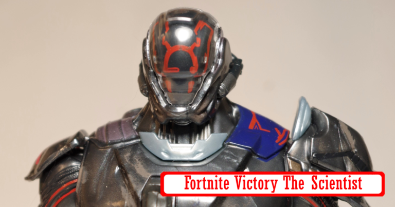
Anyway, this was one of them. In the last year, I’ve started playing a ton of Fortnite. Though I don’t own a ton of figures from the game. I don’t really want to either. Most of the ones I do have are Bananas or cat people. The Seven seem like they could be an interesting group to have all of as figures though. Mostly because I like Teams.
So far there are only two members of The Seven available though, The Scientist and The Foundation. I figure, even if I don’t bother with any others, this big robot dude would still be cool. And well, he kind of isn’t.
It’s a nice looking figure for sure. Lots of details, but there are a few problems that just drag the figure down. For starters, the face mask gimmick. Without going into a ton of Lore Details, all of the Seven wear air tight suits to protect themselves from The Loop. So they have these expressive digital Facemasks. In the game, you can select from a variety of different styles for each member’s helmet. The figure replicates this with swapable face plates and a neat light up gimmick.These face plates, do not stay on, at all. Just looking at it is enough for it to pop off and go flying who knows where. And it’s two pieces falling off, the plate itself and the clear cover. Neither stays on. I guarantee a lot of these will go missing over time.
As for the light up gimmick, it’s cool, but it also makes him incredibly top heavy. Which is a problem exacerbated by how limited his articulation is. He has plenty of joints as Hasbro 6″ figures do, but his bulk and top heavyness completely limits most of the joints to uselessness. He can’t even two hand hold his gun, and it’s the type of gun you would two hand hold.
There also seems like some plastic tolerance issues going on with his backpack because it also falls off pretty easily as well. All in all, he is just really meh. It feels like they maybe designed a decent figure, then stuck the light up gimmick in later and it ruined things a bit.
I had a lot of worry about Hasbro’s announcement of an Overwatch line. While getting more affordable versions of these characters is a nice prospect, I was very worried they would seriously screw things up. So far, it does seem to be a bit of a hit and miss line, but the hits outnumber the misses, and the misses are pretty obvious from the start.
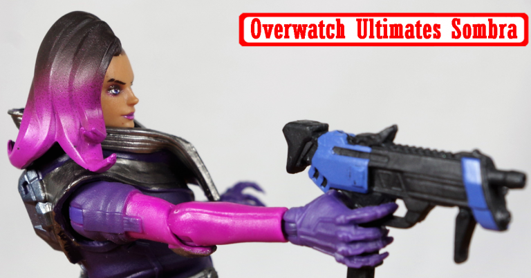
The initial wave of single packed figures consists of Lucio, Sombra, Reyes (Reaper) and Tracer. I already have the Figma Tracer, though the Hasbro one looked a lot better in person than previous photos. Reyes still looks kind of funky and I have Reaper. So I opted for Lucio and Sombra. Both are in my top Five played heroes (Along with Tracer, Mei and D.Va) and neither have Figma figures coming yet. I wanted to start off with Sombra, who actually is my most played hero in the game.
So, right off, she looks way better in person than photos suggest. One thing I have noticed in photos is there is a weird graininess texture to her that shows up that isn’t really visible on the figure itself. The colors overall look really great and the head sculpt and paint are both really nice. There are a few places she could use a bit more paint but hey, Hasbro price point. Mostly her hand details could use a quick hit of coloring. I may add that later myself.
Articulation wise, she is, alright. It’s pretty much what you would expect from any Marvel Legends female figure. Her hips are severely limited by the long coat. The coat collar also feels a smidge too tall, since it sort of hinders her head side to side. Also in traditional Hasbro BS fashion, she only has single jointed elbows. Because Hasbro pretty much never gives female figs double elbows. On a side note, the coat looks like it might be removable, with little rubber pegs the way a lot of Hasbro’s coats are, but I am not going to test that theory myself and end up ruining the coat. She looks like she is just wearing a black body suit under anyway.
She also has weird feet. Not weird as in non functional, just weird. Her ankles are pretty wide and the feet themselves seem to be some of those rubber toe shoes, and not regular shoes. I honestly have not really looked at Sombra’s feet enough to tell you if this is accurate.
For accessories she has an extra set of hands, a Translocator pod, her Uzi, and a hacking effect that can attach to one of the hands. The accessories are all pretty nice, though the hacking effect is a little cheezy looking. It’s all solid pink plastic and it’s a little short. It’s wholey understandable in it’s design though, since Hasbro probably has a lot of breakage safety rules it has to follow for it’s figures. Anything less and it would break too easily. The effect from the Sombra Nendoroid is really nice, but I also worry that I am going to snap it to pieces anytime I look at it.
Overall, Sombra is pretty great. She has a lot of expected limitations, but she is a lot more affordable than an import figure. The whole lime scales really well with the Figma line as well, so having the Hasbro line as a supplement works really well.